Naive classification beats deep-learning
How (not) to evaluate models
Overview
Mitani and co-authors’ present a deep-learning algorithm trained with retinal images and participants’ clinical data from the UK Biobank to estimate blood-haemoglobin levels and predict the presence or absence of anaemia (Mitani et al. 2020). A major limitation of the study is the inadequate evaluation of the algorithm. I will show how a naïve classification (i.e. classify everybody as healthy) performs much better than their deep-learning approach, despite their model having AUC of around 80%. I will then explain why this is the case and finish with some thoughts on how (clinical) predictions models should be evaluated.
Introduction
The goal of the paper was to investigate whether anaemia can be detected via machine-learning algorithms trained using retinal images, study participants’ metadata or the combination of both.
First, the authors develop a deep-learning algorithm to predict haemoglobin concentration (Hb) (which is the most reliable indicator of anaemia) and then three others to predict anaemia itself. They develop a deep convolutional neural network classification model to directly predict whether a patient is anaemic (rather than predicting Hb). They used the World Health Organization Hb cut-off values to label each participant as not having anaemia, mild, moderate or severe anaemia. One of the models was trained to classify: normal versus mild, moderate or severe. For concreteness, I’ll focus on this model but the reasoning below is valid for the others as well. Also, I focus on the combined model (images and metadata) because it showed the best performance (AUC of 0.88).
The authors present a detailed analysis of the data and their model. Nevertheless, a crucial point is missing. Is the model useful? If it is implemented tomorrow will it result in better care? This is important, especially since the authors argue their model potentially enables automated anaemia screening (see Discussion). This is slightly far-fetched in my opinion given they only evaluated their algorithm on a test set; with unsatisfactory results as I argue below. Algorithms need to be compared with human experts (i.e. ophthalmologists in this case), followed by extensive field testing to prove their trustworthiness and usefulness (Spiegelhalter 2020).
The Issue
As with many other models out there the authors have fallen in the trap of evaluating the absolute performance of their model when the important metric is the relative performance with respect to the actual reality of retinal screening. It is exactly the same idea when in clinical trials the experimental treatment is compared with the standard of care (or placebo). We want to see if the new treatment (deep-learning model classification in this case) is better than simply classifying every participant as having anaemia or not. This should be the benchmark. I call these naive classifications and I will demonstrate the model does not perform better than the naive rule of classifying everybody as healthy.
First, some preliminary stuff. The performance of a model can be represented in a confusion matrix with four categories (see table below). True positives (TP) are positive examples that are correctly labelled as positives, and False positives (FP) are negative examples that are labelled incorrectly as positive. Likewise, True negatives (TN) are negatives labelled correctly as negative, and false negatives (FN) refer to positive examples labelled incorrectly as negative.
| positive | negative | ||
|---|---|---|---|
| Predict | positive | TP | FP |
| negative | FN | TN |
Let’s use the information from the study to construct our confusion matrix using the data from Table 1 (last column; validation dataset) and Table 2 (column 1 and anaemia combined model). There are in total 10949 negatives (non anaemic) out of 11388 participants. The reported specificity is 0.7 and sensitivity is 0.875. Using these we can calculate the number of true negatives and true positives as follows:
- Specificity = true negative rate (TNR) = TN/#negative, so TN = 0.7*10949 = 7664.
- Sensitivity = true positive rate (TPR) = TP/ #positive, so TP = 0.875*439 = 384.
So the confusion matrix is
| positive | negative | ||
|---|---|---|---|
| Predict | positive | 384 | 3285 |
| negative | 55 | 7664 |
Looking at the table we see that in total 3285+55 = 3340 subjects have been misclassified. That is 29% misclassification rate.
Now, let’s construct the confusion matrix for my naïve classification: “classify everybody as negative”,
| positive | negative | ||
|---|---|---|---|
| Predict | positive | 0 | 0 |
| negative | 439 | 10949 |
In total, 439 subjects have been misclassified. This is 4% misclassification rate.
This means the naive classification achieves 86% better performance!
ROC (and AUC) is to blame
Why was this not spotted by the authors? Probably because the model evaluation was based on the receiver operating curve (ROC) and area under the ROC (AUC). ROC curves can present an overly optimistic view of a model’s performance if there is a large skew in the class distribution. In this study the ratio positive (i.e. anaemic) to negative (i.e. not anaemic) participants is 439/10949 = 0.04 (see Table 2, validation column)!
ROC curves (and AUC) have the (un-)attractive property of being insensitive to changes in class distribution (Fawcett 2006). That is, if the proportion of positive to negative instances changes in a dataset, the ROC curves (and AUC) will not change. This is because ROC plots are based upon TPR and FPR which do not depend on class distributions. Increasing the number of positive samples by 10x would increase both TP and FN by 10x, which would not change the TPR at any threshold. Similarly, increasing the number of negative samples by 10x would increase both TN and FP by 10x, which would not change the FPR at any threshold. Thus, both the shape of the ROC curve and the AUC are insensitive to the class distribution. On the contrary, any performance metric that uses values from both columns will be inherently sensitive to class skews, for instance the misclassification rate.
Let’s make this more concrete with a simple simulation example. I simulate one covariate, \(X\), which follows a standard Gaussian distribution in negative cases: \(X \sim N(0, 1)\). Among positives, it follows \(X \sim N(1.5, 1)\). The event rate (i.e. prevalence) is varied to be \(20\%\) (I call this scenario 1) and \(2\%\) (scenario 2). (The \(2\%\) is close to the one observed in the study \(\approx 4\%\)). Then, I derive true risks (\(R\)) based on the event rate (\(ER\)) and the density of the covariate distributions for positives (\(D_p\)) and negatives (\(D_{n}\)) at the covariate values:
\[ R = \frac{ER × D_p}{[ER × D_p] + [(1 − ER) × D_{n}]}.\]
I simulate two large samples of 5000 and 50000 and plot the ROC. The two plots below are almost identical despite the fact that scenario 2 has 10x more negative examples than scenario 1.
library(pROC)
library(tibble)
sim_data <- function(n_positives, n_negatives){# simulates dataset as described above and calculates the ROC
    # input arguments: the number of positives and negatives

    y <- c(rep(0, n_negatives), rep(1, n_positives)) # binary response
    x <- c(rnorm(n_negatives), rnorm(n_positives, mean = 1.5)) # simulate covariate
    df <- data.frame(y = y, x = x)

    ER <- mean(df$y) # event rate
    Dp <- dnorm(df$x, mean = 1.5, sd = 1) # covariate density for positives
    Dn <- dnorm(df$x, mean = 0, sd = 1) # covariate density for negatives

    true_risk <- (ER * Dp)/((ER * Dp) + ((1 - ER) * Dn))  # true risks

    roc_sim <- roc(df$y, true_risk) # calculates ROC curve

    df <- tibble(FPR = 1 - roc_sim$specificities, # false positive rate
                 TPR = roc_sim$sensitivities) # true positive rate

    return(df)
}
n.sims <- 20 # times simulation is repeated
n.positives <- 1000 # number of positives
n.negatives <- 4000 # number of negatives
library(purrr)
library(dplyr)
# scenario 1
multiplier <- 1 # the multiplier adjusts the number of the negatives - so I can have the event rate I want
sims1 <- n.sims %>%
rerun(sim_data(n.positives, n.negatives * multiplier)) %>%
map(~ data.frame(.x)) %>%
plyr::ldply(., data.frame, .id = "Name") %>%
mutate(sims = rep(1:n.sims, each = sum(n.positives + n.negatives * multiplier) + 1),
Scenario = "Scenario 1")
# scenario 2
multiplier <- 10
sims2 <- n.sims %>%
rerun(sim_data(n.positives, n.negatives * multiplier)) %>%
map(~ data.frame(.x)) %>%
plyr::ldply(., data.frame, .id = "Name") %>%
mutate(sims = rep(1:n.sims, each = sum(n.positives + n.negatives * multiplier) + 1),
Scenario = "Scenario 2")
df_final <- rbind(sims1, sims2)
library(ggplot2)
ggplot(df_final) +
geom_line(aes(x = FPR, y = TPR, group = sims, col = Scenario), alpha = 0.8) +
facet_grid(~ Scenario)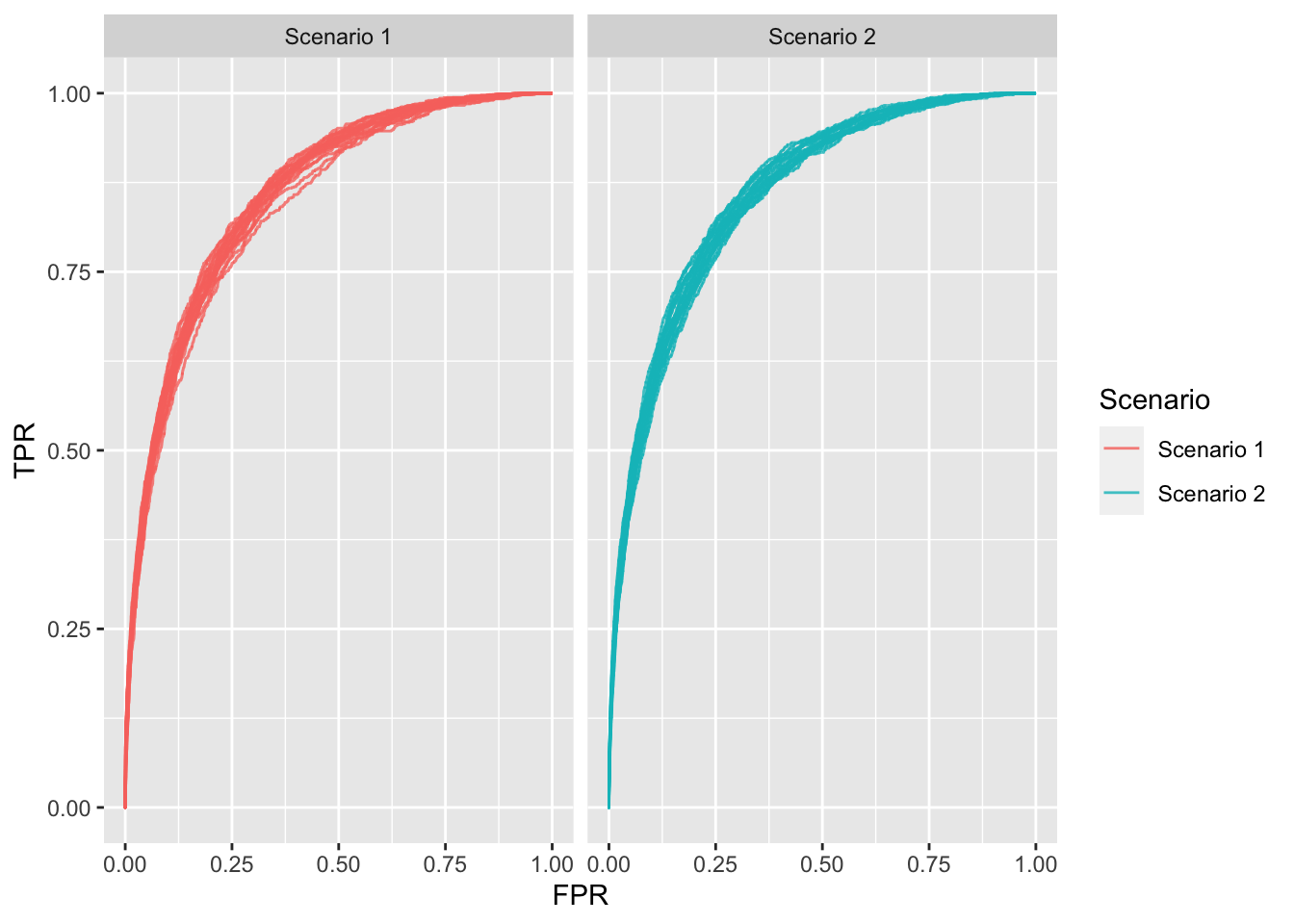
Figure 1: ROC plots for each scenario; 20 repetitions each.
Unequal misclassification costs
Of course, my naive classification can be easily debated by noting that the misclassification rate makes an inherent assumption, which is unlikely to be true in anaemia screening: it assumes that misclassifying someone with anaemia is of the same severity as misclassifying a healthy subject. This implies that one type of error is more costly (i.e. worse) than the other. In other words, the costs are asymmetric. I agree that most of time this is the case. This information should be taken into account when evaluating or fitting models.
Some methods to account for differing consequences of correct and incorrect classification when evaluating models are the Weighted Net Reclassification Improvement (Pencina et al. 2011), Relative Utility (Baker et al. 2009), Net Benefit (Vickers and Elkin 2006) and the \(H\) measure (Hand 2009). Another option is to design models/algorithms that take misclassification costs into consideration. This area of research is called cost-sensitive learning (Elkan 2001).
This is another reason the ROC (AUC) is inadequate metric (in addition to the insensitivity in class imbalance). It ignores clinical differentials in misclassification costs and, therefore, risks finding a model worthwhile (or worthless) when patients and clinicians would consider otherwise. Strictly speaking, ROC weighs changes in sensitivity and specificity equally only where the curve slope equals one (Fawcett 2006). Other points assign different weights, determined by curve shape and without considering any clinically meaningful information. Thus, AUC can consider a model that increases sensitivity at low specificity superior to one that increases sensitivity at high specificity. However, in some situations, in disease screening for instance, better tests must increase sensitivity at high specificity to avoid numerous false positives.
A way forward: estimate and validate probabilities
Ultimately, the quality of algorithms is exposed to the nature of the performance metrics chosen. We must carefully choose the goals we ask these systems to optimize. Evaluation of models for use in healthcare should take the intended purpose of the model into account. Metrics such as AUC are rarely of any use in clinical practise. AUC represents how likely it is that the model will rank a pair of subjects; one with anaemia and one without, in the correct order, across all possible thresholds. More intuitively, AUC is the chance that a randomly selected participant with anaemia will be ranked above a randomly selected healthy participant. However, patients do not walk into the clinician’s room in pairs, and patients want their results, rather than the order of their results compared with another patient. They care about their individual risk of having a disease/condition (being anaemic in this case). Hence, the focus of modelling should be on estimating and validating risks/probabilities rather than the chance of correctly ranking a pair of patients.
Consequently, model evaluation/comparison should focus (primarily) on calibration. Calibration refers to the agreement between observed and predicted probabilities. This means that for future cases predicted to be in class \(A\) with probability \(p\), a proportion of \(p\) cases will truly belong in class \(A\), and this should be true for all \(p\) in (0,1). In other words, for every 100 patients given a risk of \(p\)%, close to \(p\) have the event. Calibration approaches appropriate for representing prediction accuracy are crucial, especially when treatment decisions are made based on probability thresholds. Calibration of a model can be evaluated graphically by plotting expected against observed probabilities (Steyerberg et al. 2004) or using an aggregate score. The most widely used is the Brier score, which is given by the average over all squared differences between an observation and its predicted probability (Brier 1950). (It has nice properties (Gneiting and Raftery 2007; see e.g. Spiegelhalter 1986)).
To conclude, machine learning models in healthcare need rigorous evaluation. Beyond ethical, legal and moral issues, the technical/statistical fitness of the models needs thorough assessment. Statistical analysis should consider clinically relevant evaluation metrics. Motivated by the paper of Mitani et al. (2020) I have re-demonstrated why AUC is an irrelevant metric for clinical practise. This is because it is insensitive to class imbalances and integrates over all error regimes (under the best case scenario). This becomes increasingly important in predicting rare outcomes, where operating in a regime that corresponds to a high false positive rate may be impractical, because costly interventions might be applied in situations in which patients are unlikely to benefit. A way forward is to focus on evaluating predictions rather than (in addition to) classifications. That is, focus on estimating and evaluating probabilities. These convey more useful information to clinicians and patients in order to aid decision making.
Further reading
The limitations of the ROC (and AUC) have been discussed in
Cook NR . Use and misuse of the receiver operating characteristic curve in risk prediction. Circulation (2007).
Pencina, Michael J., et al. “Evaluating the added predictive ability of a new marker: from area under the ROC curve to reclassification and beyond.” Statistics in medicine (2008).
Hand, David J. “Evaluating diagnostic tests: the area under the ROC curve and the balance of errors.” Statistics in medicine (2010).
Hand, David J., and Christoforos Anagnostopoulos. “When is the area under the receiver operating characteristic curve an appropriate measure of classifier performance?.” Pattern Recognition Letters (2013).
Halligan, Steve, Douglas G. Altman, and Susan Mallett. “Disadvantages of using the area under the receiver operating characteristic curve to assess imaging tests: a discussion and proposal for an alternative approach.” European radiology (2015).
On probability estimation and evaluation:
Kruppa, Jochen, Andreas Ziegler, and Inke R. König. “Risk estimation and risk prediction using machine-learning methods.” Human genetics (2012).
Kruppa, Jochen, et al. “Probability estimation with machine learning methods for dichotomous and multicategory outcome: Theory.” Biometrical Journal (2014).
Kruppa, Jochen, et al. “Probability estimation with machine learning methods for dichotomous and multicategory outcome: Applications.” Biometrical Journal (2014).