Table vs graph
Shall I display my data using a table or a graph? The usual answer is: it depends. Mostly, it depends on who the audience is and how the data will be used. I agree, but Alaa et al, 2021 may have gone a bit too far using tables.
I’ll start with a brief summary of the paper.
It is about the development of Adjutorium - a machine learning algorithm for breast cancer prognostication. The authors motivate the development of Adjutorium by stating that a widely used model (PREDICT v2.1) under-performs in specific subgroups of patients. They then compare the accuracy of Adjutorium in predicting all-cause and breast cancer-specific mortality at 3, 5 and 10 years from baseline with PREDICT v2.1. In addition, they compare Adjutorium to an in-house Cox proportional hazards (Cox PH) regression model. They use a series of measures to assess the three models, AUC-ROC, Harrel’s C-index and Uno’s C-index. They conclude that “Adjutorium uniformly outperformed PREDICT v2.1 and the conventional Cox PH model in predicting all-cause and breast cancer-specific mortality”.
This statement is mostly based on Table 1. But, the table is cramped with so many values that is difficult to draw any conclusions - unless you spend hours on it.
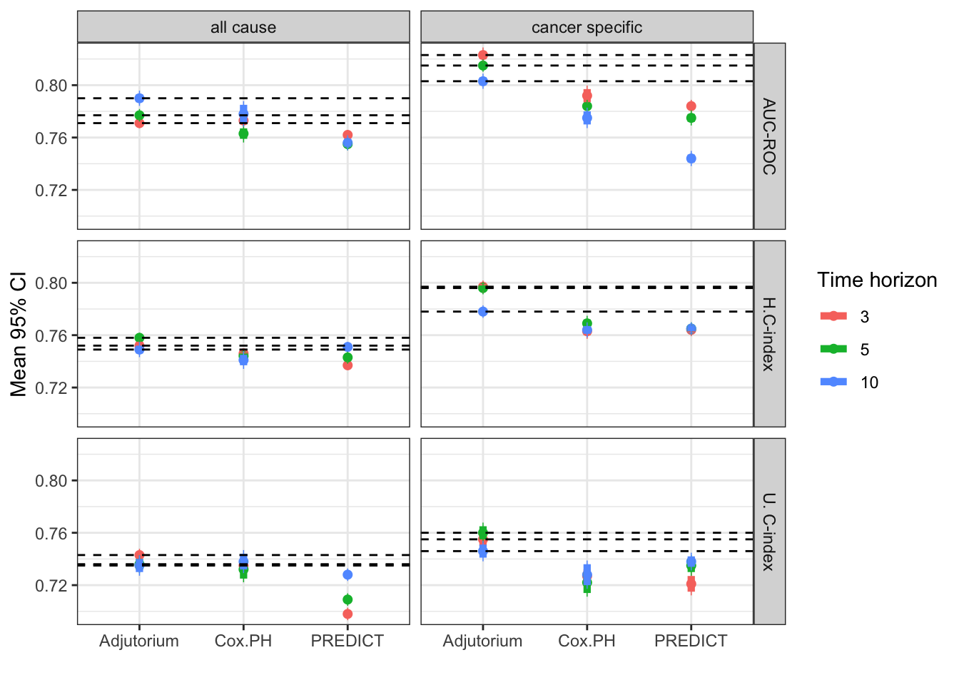
I argue that the main message they are trying to convey is not contained in the actual values, which would justify this tabular form, but in the “shape” of the values. They want to reveal the relationships among the three models. That is why I believe a graph would communicate the message more efficiently. So, below I plot the bottom panel (external validation cohort) of their Table 1.
The horizontal lines show the performance of Adjutorium. In general, Adjutorium performs better. The improvement in performance is more evident for the cancer-specific mortality (right panel).
Interestingly though, the conclusions depend the choice of performance measure. For example, using the AUC-ROC and Uno’s C-index the simpler Cox PH model predicts all-cause mortality equally well to Adjutorium.
In general, I find graphs more informative - it is easier to see trends in the data when it is displayed visually compared to when it is displayed numerically in a table.