The Great Unnaming
Picture a class of thirty girls. How many share a first name with someone else in the room?
In 1880, about ten of them. In 2023, roughly one.
That collapse — from a third of the room to almost no one — is one of the cleaner social signals. A single birth certificate records a private choice; a century of them stacked together records something larger. Somewhere between 1880 and now, naming stopped being an act of belonging — to a family, a saint, a generation — and became an act of distinction.
That shift is the story of this post. Everything after this is an attempt to quantify it — and to see whether the easy explanation survives contact with the data.
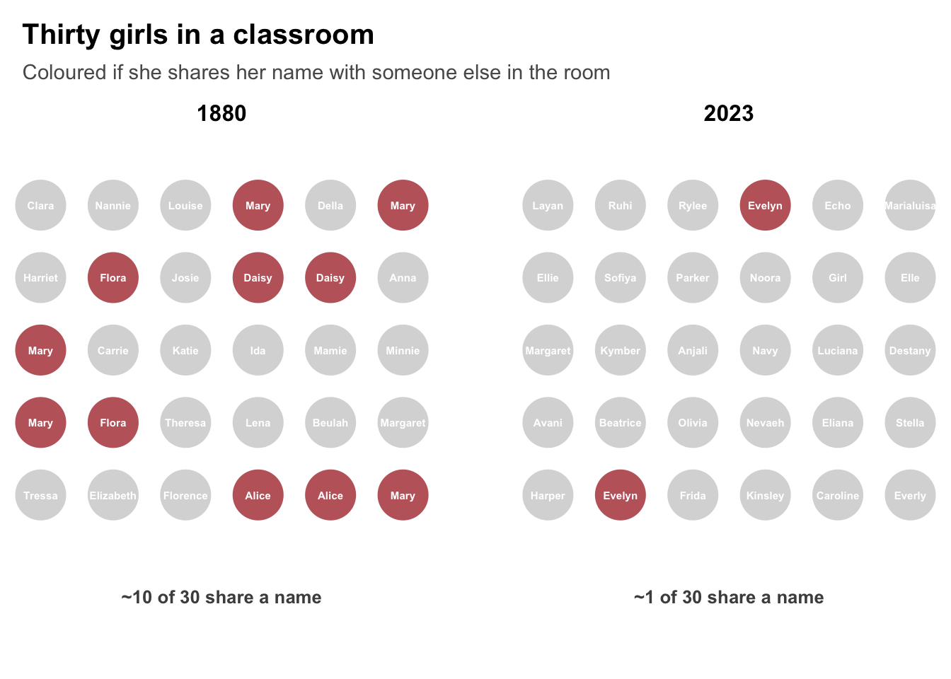
Figure 1: Two classrooms, 143 years apart. Thirty girls per room, names drawn at random from that year’s US births; red marks a girl who shares her name with a classmate. Around ten overlap in 1880, roughly one in 2023. See Methodology for details.
I use data published by The Economist where they analysed the first names of almost 400m people born in America and Britain in the past 143 years.
Figure 2 shows every name that has ever topped the American charts, traced across its whole life — the year it arrived, the height it reached, the long decline after. Boys in blue, girls in red, each labelled at its own peak.
Two things are visible at once: names come and go in waves, and every wave breaks lower than the one before it. John and Mary held around one baby in twelve; Liam and Olivia hold about one in a hundred.
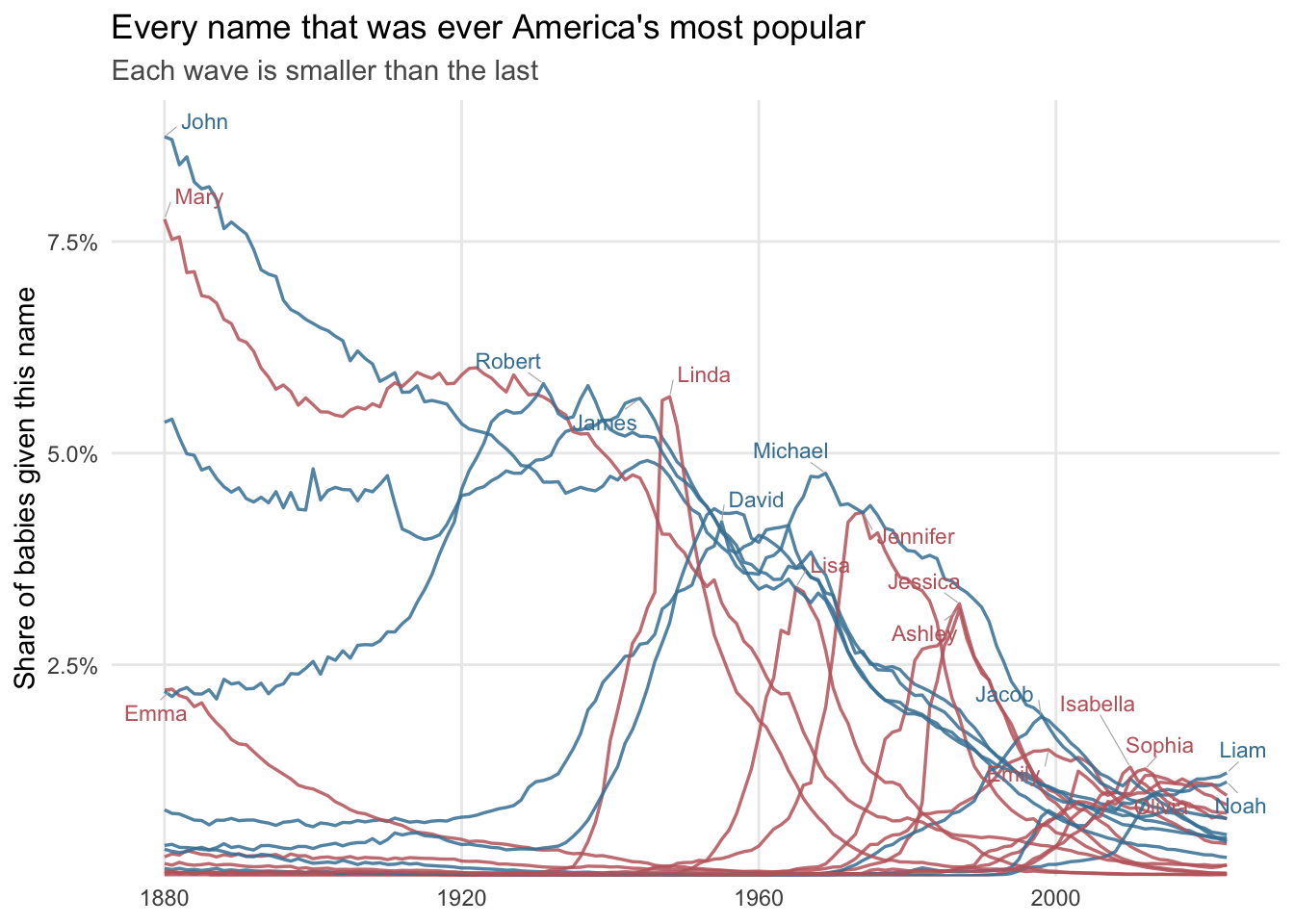
Figure 2: Most popular names in the US.
The dominant pattern is de-concentration
To verify whether this pattern is more widespread than the most popular name I took the top ten most popular ones of each decade. Figure 3 shows them as a band: the solid line is the decade’s number one, the shaded region stretches down to the tenth. Labels mark each name’s reign — Mary held the top spot for seven consecutive decades, John and Michael for four each. Two things happen at once. The band falls, so the leading names command steadily less of each cohort. And it narrows, so the gap between first and tenth place shrinks over time. There is no longer a name that stands out from the pack.
For instance, in the 1880s the top American girl’s name (Mary) took ~6–7% of all female births on its own, and the whole top-ten band sat between roughly 2% and 7%. By the 2010s the entire top ten has collapsed into a thin ribbon near 1%. The band also narrows as it falls — early on there’s a big gap between #1 and #10, now they’re nearly indistinguishable: no name is meaningfully “the” name anymore.
The UK series is barely there. ONS data starts in 1996, so the UK contributes two or three decade points against the US’s fourteen.
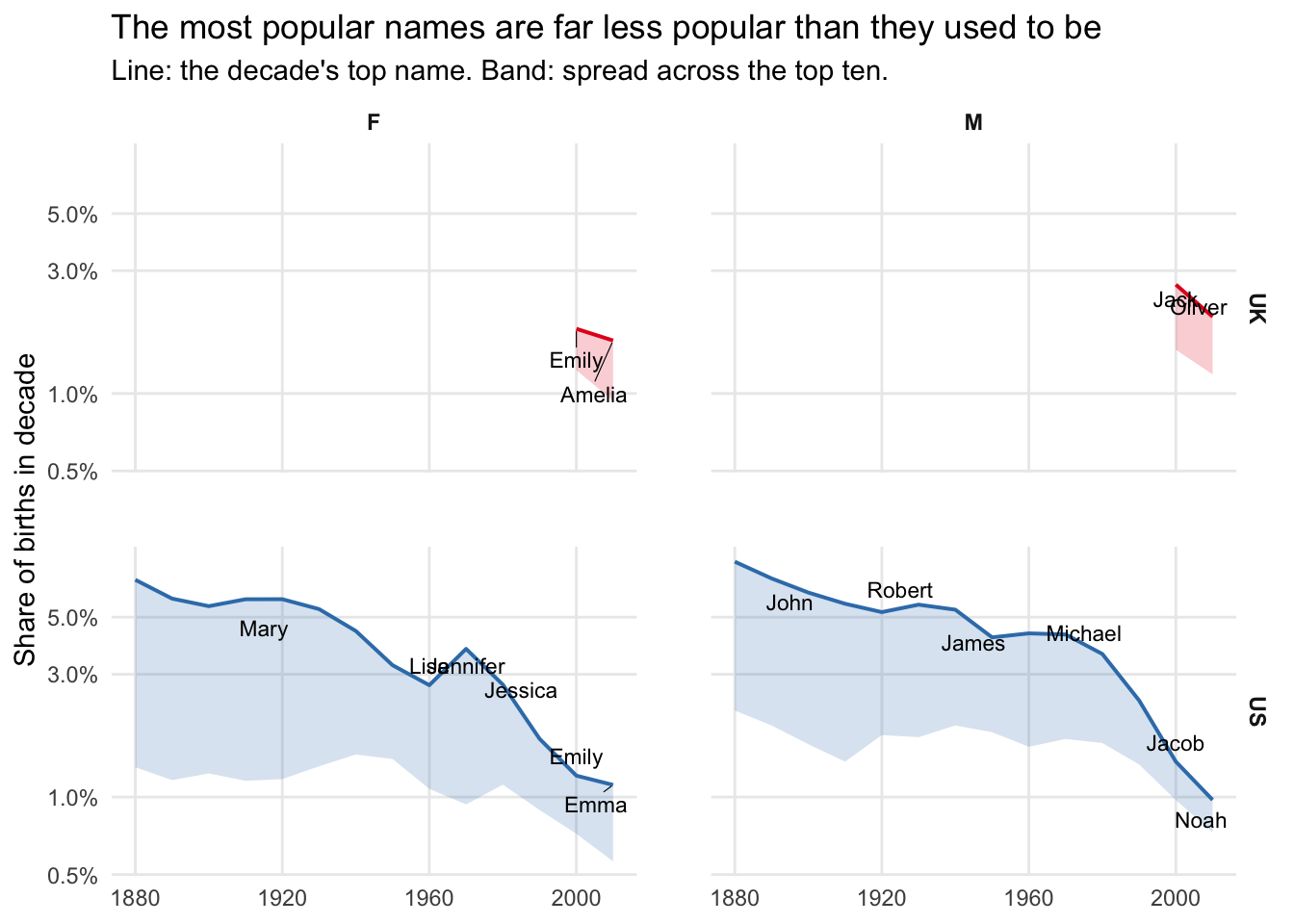
Figure 3: Top 10 most popular names in the US and UK, by gender.
How Many Names Is That, Really?
That’s what happened at the top. The question is what happened underneath it — and for that, the ten most popular names aren’t enough to go on.
The simplest thing to do would be to count how many different names appear each year. But that mostly tells us how many babies were born — bigger cohorts throw up more one-offs, and the total climbs without anything really changing about how people choose.
So instead of counting names, we can count effective names (see Methodology). If every name in use were equally popular, how many would you need to produce the variety we actually see?
By this measure, 1880 comes out at about 190. That’s a year in which one name in fourteen girls was Mary — so it’s not that Victorian parents knew only 190 names, it’s that the ones they used were clustered tightly enough to behave like 190 evenly-shared names.
Figure 4 shows three things:
The rise is enormous: American girls go from about 190 effective names in 1880 to roughly 2,200 today, an eleven-fold increase, with boys following the same path.
The 1960 inflection: There’s a rise to about 1900, then a genuine plateau from roughly 1900 to 1955 — girls hover around 300–340, boys around 180–245, with no net gain across five decades including two world wars. The takeoff starts around 1960 and steepens continuously after.
And the sexes have swapped roles: Girls’ names were always more varied, and the gap widened until about 1980 — but boys have been catching up fast ever since, and the two panels seem to be converging.
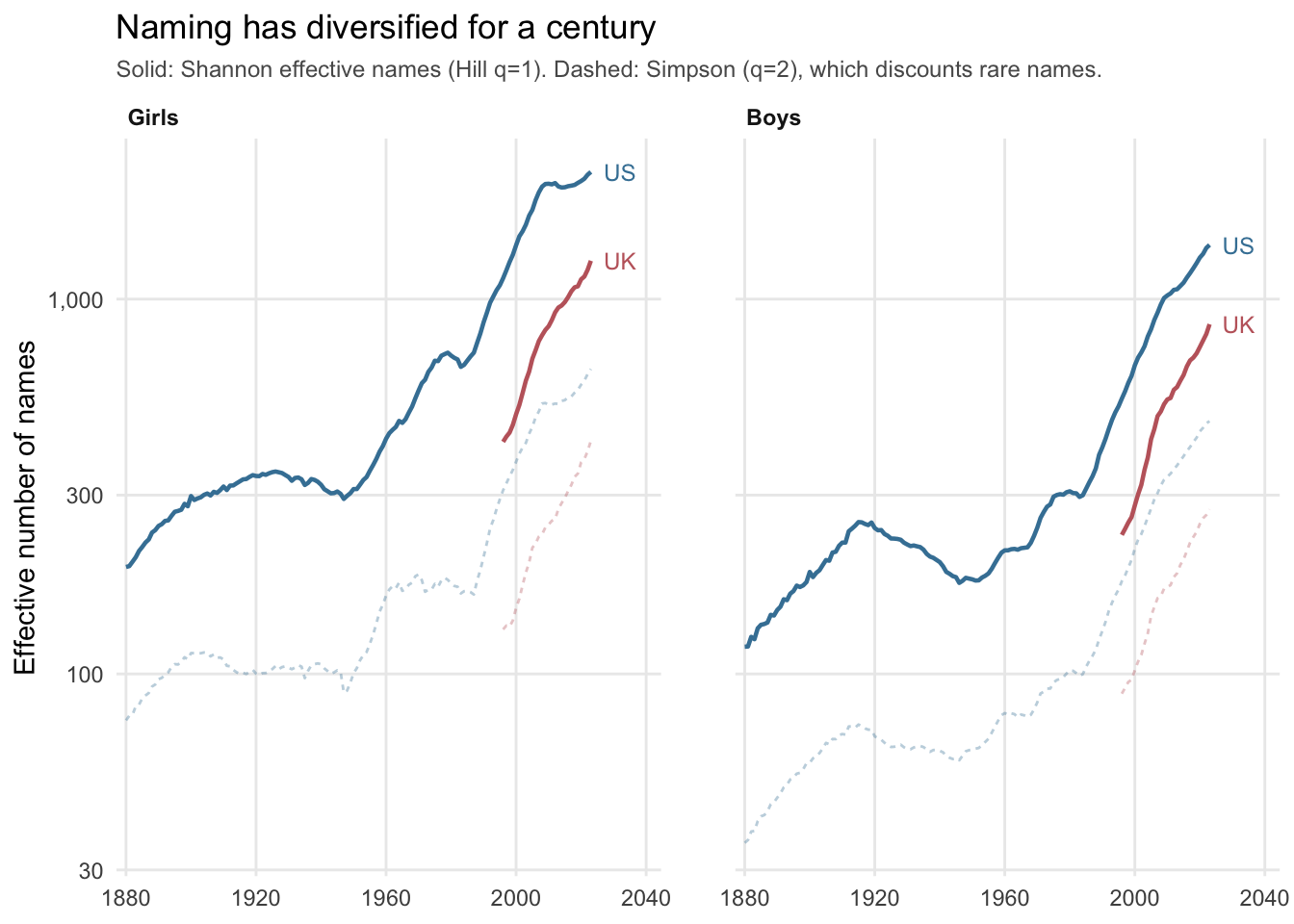
Figure 4: How concentrated are names in a few popular choices? The higher the lower the concentration.
A Change in Values, or Just in Vocabulary?
So naming fragmented — but fragmented away from what, and toward what? The effective-names curve is blind to this: it counts how many names were in play and treats them all as interchangeable tokens. Mary and Nevaeh are just two entries in a distribution. Yet the interesting question isn’t how many names parents had to choose from, it’s whether the reasons for choosing changed. Was the explosion in variety a change in values, or just a change in vocabulary? For that we need to know something about the names themselves.
To do this we can look at their connotations.
What the plot shows:
Tradition collapses, and it’s the only category that does: US boys sit at 75–78% from 1880 straight through to 1940 — flat for sixty years — then fall away: 73% (1940), 55% (1960), 44% (1980), 38% today. Girls run the same shape at half the level: 38% through 1940, then 26% (1960), 18% (1980). The steepest decades are the 1950s and 1970s.
Boys are named for strength, girls for beauty, and that has not changed: Strength runs 70–78% for boys and 35–42% for girls across the entire period. Beauty is 51–61% for girls and 2–4% for boys. Both are essentially flat lines for 144 years.
Love has an arc. Girls rise from 31% in 1920 to a peak of 60.5% in 1969, then fall to 25% today. Boys trace a muted version of the same curve. That peak year is either a lovely coincidence or not one.
Religious goes the wrong way. Boys dip to 21% in 1920, then rise to a 36% peak in 1983 and sit at 26% now — up over the period when everything else was fragmenting. Girls decline steadily, 12% to 7%.
The main prediction holds, with the right lead-lag. The Hill curve is flat 1900–1955 (see Figure 4) and takes off around 1960. Tradition is flat 1880–1940 and starts falling around 1945. The canon loosens first, diversity rises after, with roughly a fifteen-year lag. That ordering matters — it’s the difference between two correlated trends and a mechanism. Naming diversified because parents stopped drawing from an inherited stock, and we can date this loosening to the immediate postwar years.
But the religious half of the prediction fails. If the story were simple secularisation, religious would track tradition down. It rises instead. So “tradition” here isn’t measuring piety — it’s measuring inheritance, the practice of reusing a canonical name. Biblical names stayed popular; naming your son after his grandfather did not.
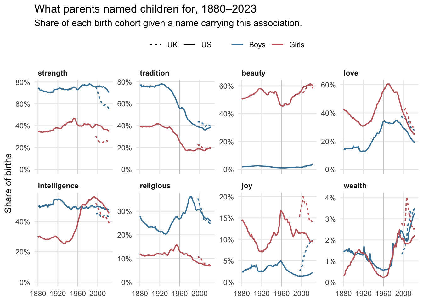
Figure 5: Name connotations.
Conclusions
Return to the two classrooms. The 1880 room — ten girls answering to the same handful of names — wasn’t the product of a smaller imagination. Parents then could have chosen freely and didn’t; they reached, overwhelmingly, for the same inherited stock: the grandmother’s name, the saint’s name, the name three houses down. The 2023 room, almost every desk a different name, is what happened when that reflex faded.
But the post set out to test whether the easy explanation — a society turning individualist, parents chasing uniqueness — survives the data. It half survives. The reaching for distinction is real: it’s written into every curve, the falling top-ten band, the eleven-fold rise in effective names, the takeoff after 1960. Yet the connotations refuse to move with it. Boys are still named for strength, girls still for beauty, in almost exactly the proportions of 1880. What parents wanted a name to say held constant for 144 years; only the vocabulary they said it in widened.
So the shift wasn’t from one set of values to another. It was the loosening of a single practice — inheritance, the reuse of a canonical name — and the timing gives it away: the canon begins thinning around 1945, and diversity climbs about fifteen years later. Names became twelve times more varied without becoming any less about the same old things.
What children are named changed beyond recognition; what they’re named for barely moved at all.
Methodology
Figure 1: The classroom visualisation contrasts the concentration of US female names in 1880 and 2023. For each year I converted birth counts to an empirical name distribution, \(p_i = n_i / \sum n\), so that \(p_i\) gives the probability that a randomly selected girl carries name \(i\). From this distribution I computed Simpson’s concentration index, \(S = \sum p_i^2\), the probability that two independently drawn girls share a name, and approximated the expected number of children in a room of thirty who share a name with at least one classmate as \(30 (1 − (1 − S)^{29})\), treating each of a child’s twenty-nine roommates as an independent event of probability \(S\). This expression slightly understates the exact expectation under a skewed distribution, but at the observed values of S (≈0.014 in 1880, ≈0.001 in 2023) the discrepancy is negligible. To render the result concretely, I simulated a classroom by drawing thirty names with replacement from each year’s distribution and flagging every name that occurred more than once; because a single draw may be unrepresentative, I scanned random seeds and retained the first whose realised count of name-sharers fell close to the analytic expectation (nine to eleven in 1880, one to two in 2023), thereby displaying a typical rather than a fortuitous classroom. The thirty children were then arranged on a six-by-five grid and coloured according to whether their name was shared, with panels faceted by year.
Figure 4: Name diversity was summarised using Hill numbers, the effective-species framework of Jost, L. (2006). The Hill number of order q gives the number of equally frequent names that would produce the observed diversity, with q controlling the weight placed on rare versus common names: q=0 counts distinct names irrespective of frequency, q=1 (the exponential of Shannon entropy) weights names in proportion to their frequency, and q=2 (the inverse Simpson index) weights them by the square of their frequency and is dominated by the most common names.
I report q=1 as the primary measure and q=2 alongside it as a sensitivity analysis. Registry data are subject to frequency-based suppression — names falling below a minimum annual count are withheld — and these thresholds differ between the US and UK sources. The number of rare names observed therefore depends on both the suppression rule and the size of the birth cohort, neither of which is a property of naming behaviour. Since q increases the weight given to common names, agreement between q=1 and q=2 provides evidence that a result is not an artifact of differential coverage in the tail. Across all series the ratio of q=1 to q=2 remained between 2.6 and 3.9 with no systematic trend over time and no divergence between countries, indicating that both the century-scale increase in diversity and the US–UK difference are driven by the common part of the name distribution.